Turtle & Bloom is an IP-first media company and creative studio built to tell African stories that last generations, spanning children's media, film, animation, visual arts, and books.
The brief was to develop a brand identity to serve as the visual foundation of a company that wants to build the next Bluey, the next Aardman—culturally rooted, globally fluent, and built to endure.
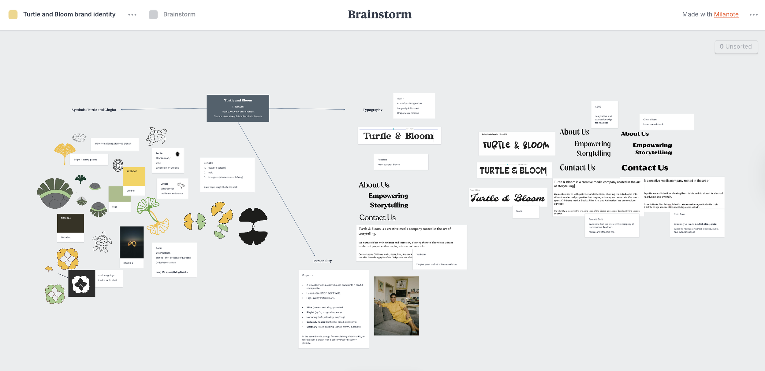
The design process began with a discovery call that revealed the emotional core of the brand: the founder’s story of growing slowly through difficulty, knowing she was building something that would outlast her. When I asked about the ‘bloom’ part of the company’s name, she mentioned the ginkgo tree, one of the oldest living species on earth, slow to grow, and often described as impossible to kill. (Ginkgo trees within a close radius of the 1945 bombing of Hiroshima sprouted new leaves the next year.) The two symbols—turtle and ginkgo—share a logic: both have growth rings, both are living fossils, both represent patience rewarded by extraordinary longevity.
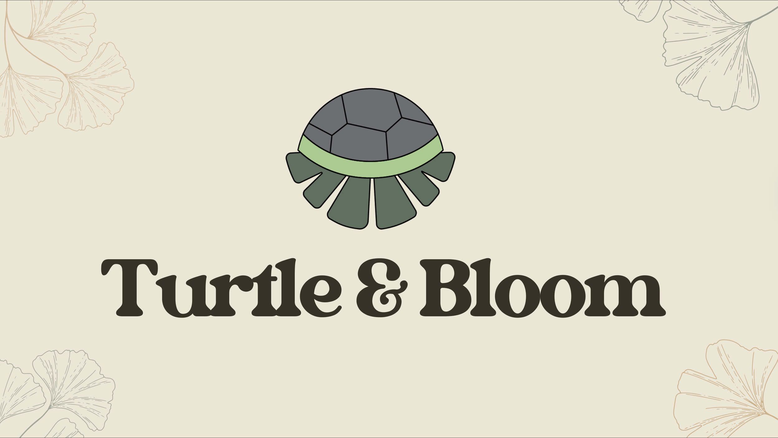
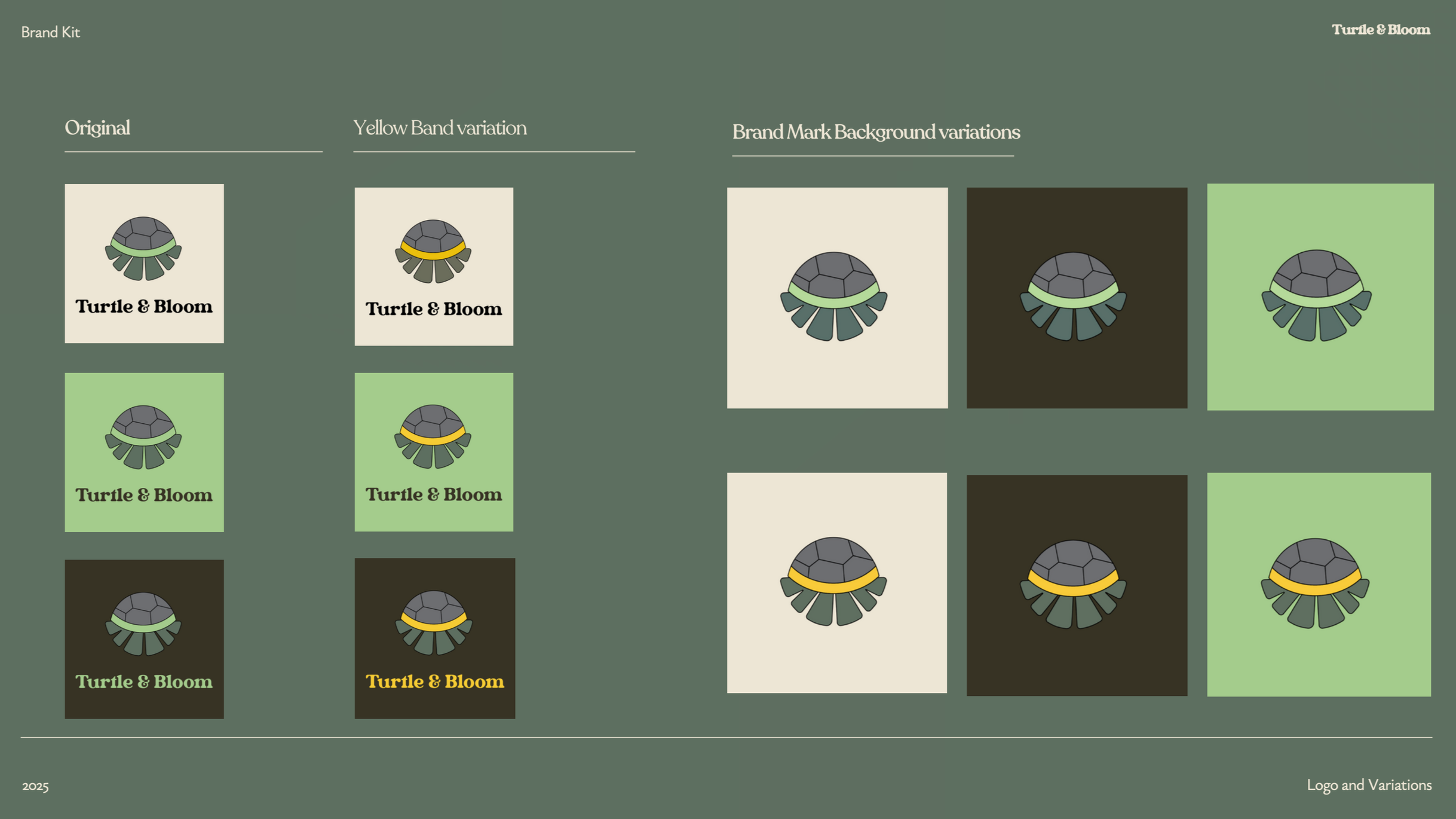
The logo, a ginkgo leaf blooming out of a turtle shell, embodies the growth that emerges from resilience.
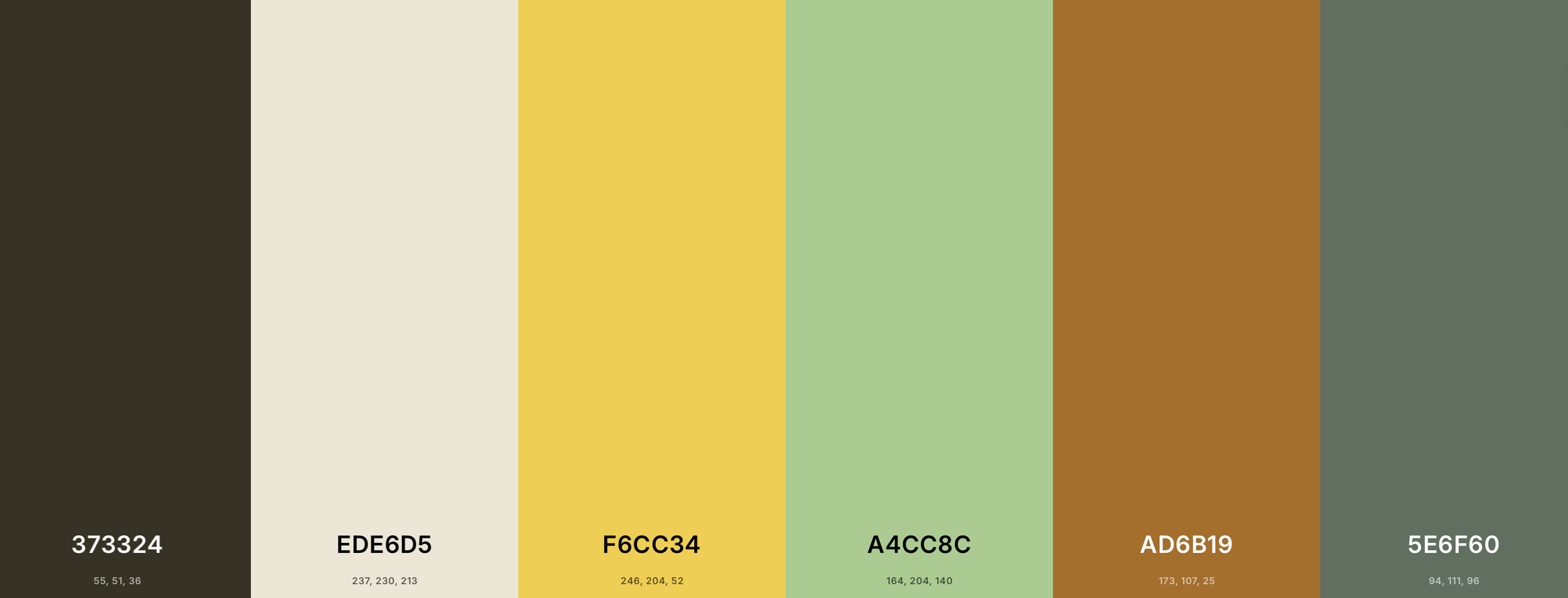
The colour palette—ginkgo fall yellow, ginkgo spring green, charcoal, eternal beige, shell boom grey, molding clay—was selected for its range. Warm enough for a children's book, grounded enough for a historical fiction film.
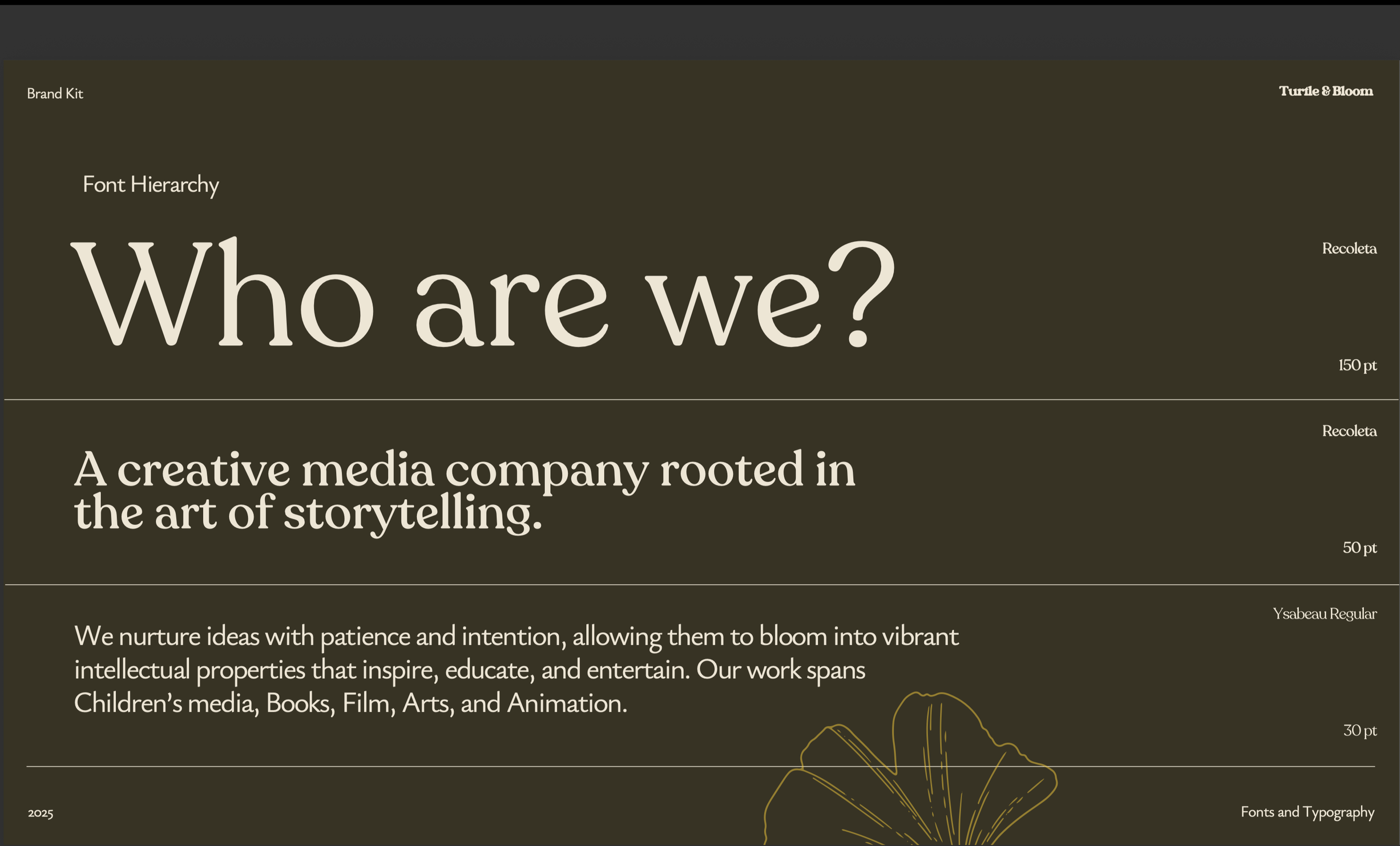
The beautiful Recoleta and Ysabeau fonts were selected to balance authority and imagination. The serif wordmark carries weight and timelessness, while the secondary font keeps it accessible and alive. Ysabeau is a French name that means ‘God is my abundance’, a nod to the spirit of resilience in the kernel of this project.
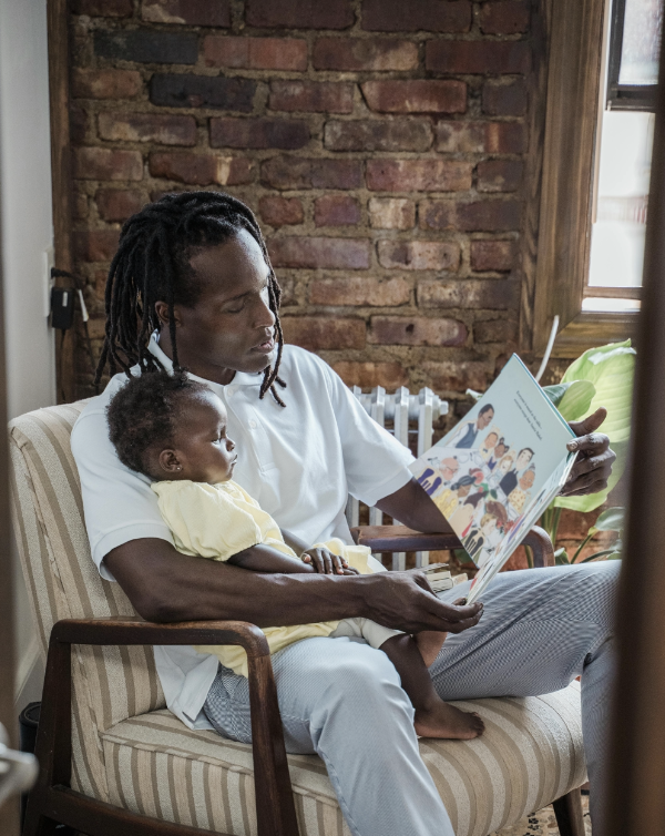
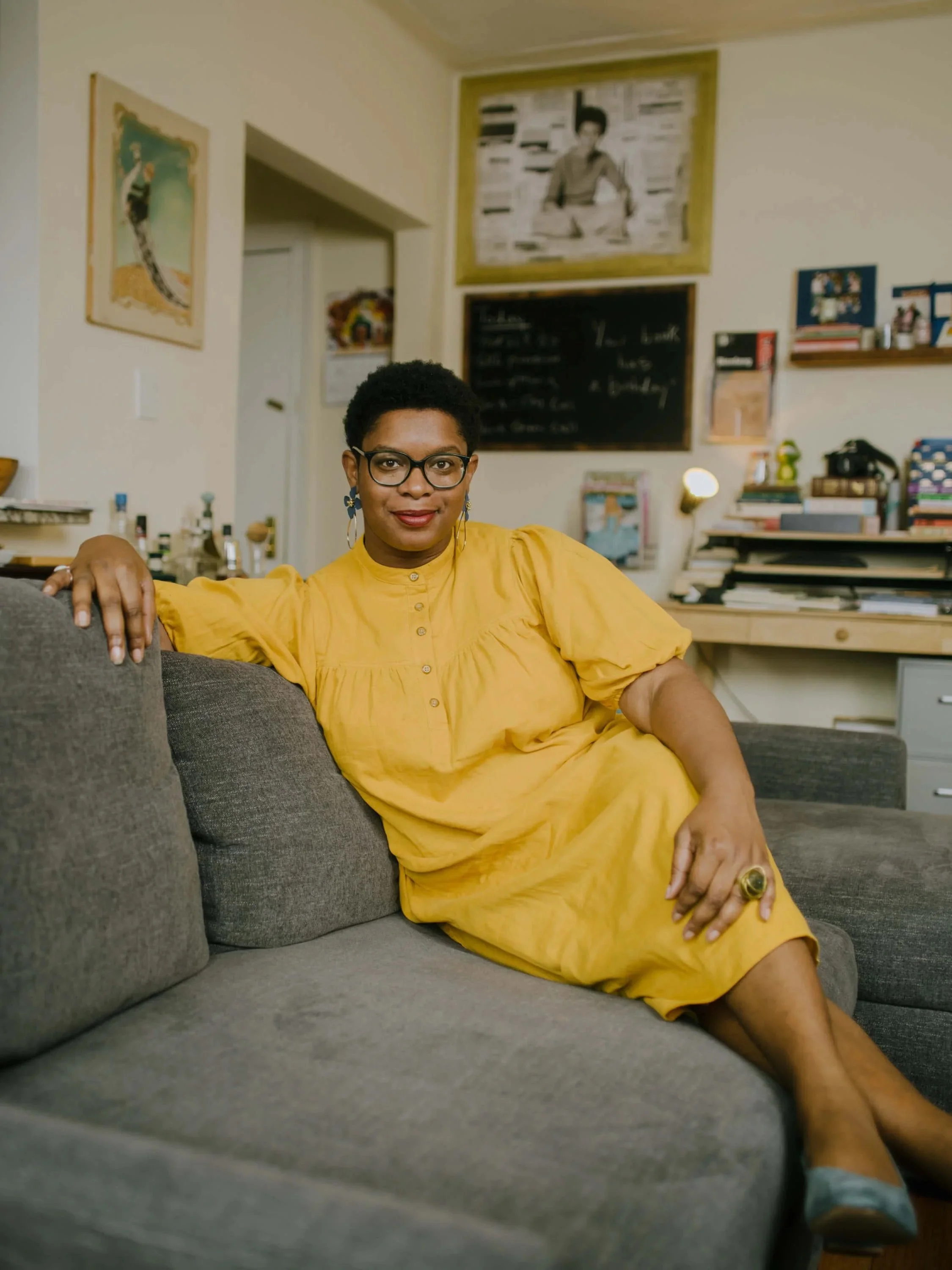
The brand personality was articulated as a wise storytelling elder who can switch into a playful auntie. One who explains maths to a child, and in the same breath, returns to telling an adult's self-discovery story. I drew from storytellers such as the American writer Ashley Ford, and a dear uncle from my childhood, who told my siblings and me tortoise fables as soon as he walked in through the door back from work.
That range was the design challenge, and the answer was a brand system flexible enough to hold breadth without losing coherence. The deliverables included a full logo suite, colour palette, typography system, brand kit document, and mockups.