Printing Art Books in Lagos
Publication Design & Writing
Commissioned by the Goethe-Institut Nigeria's We Make Books initiative
This was a design research project for a guide to navigating the printing landscape in Lagos, drawn from three months of fieldwork, industry conversations, and hands-on production experience. The design direction was for the report to make the reader feel like they were moving through the researcher’s process with them.
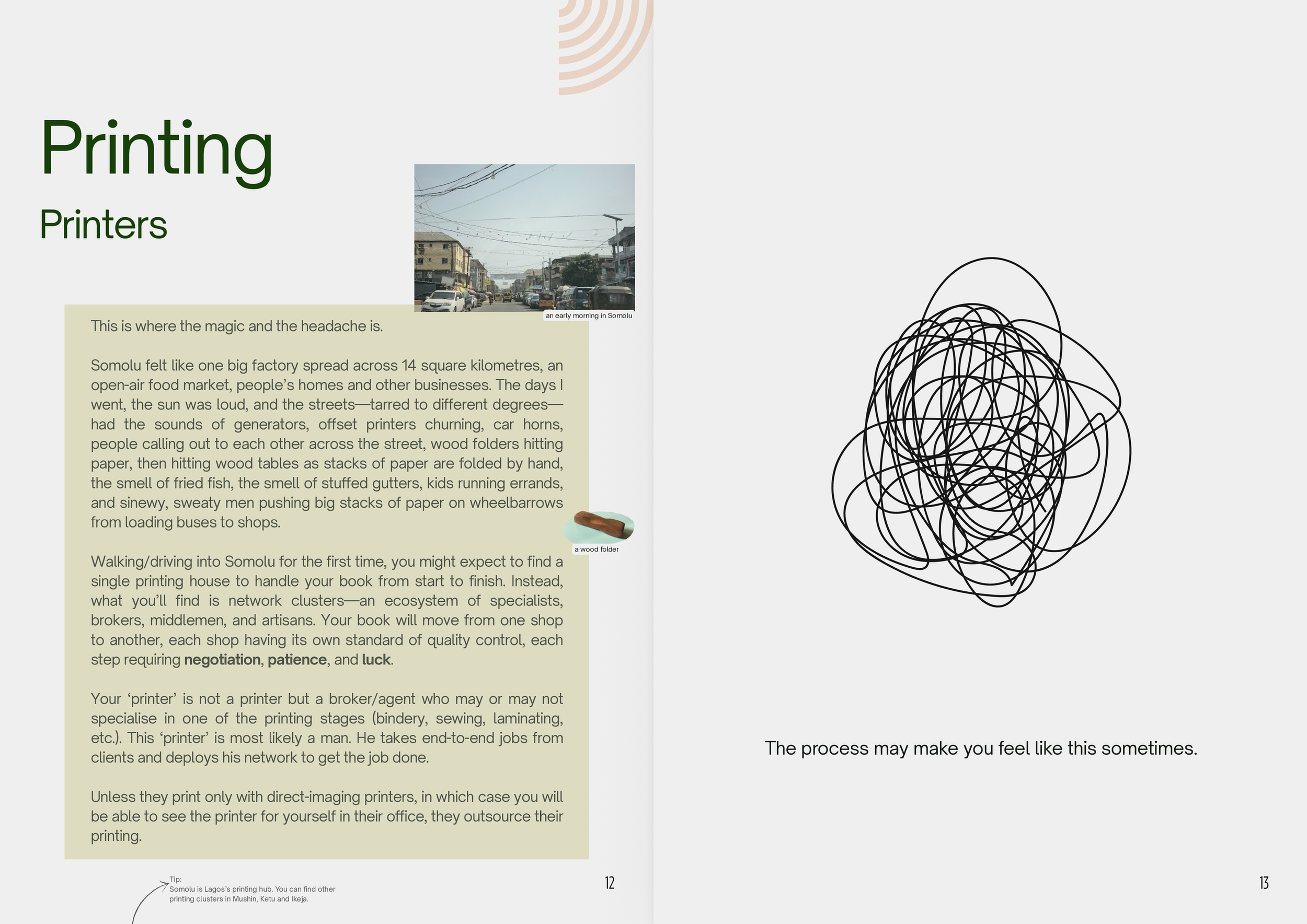
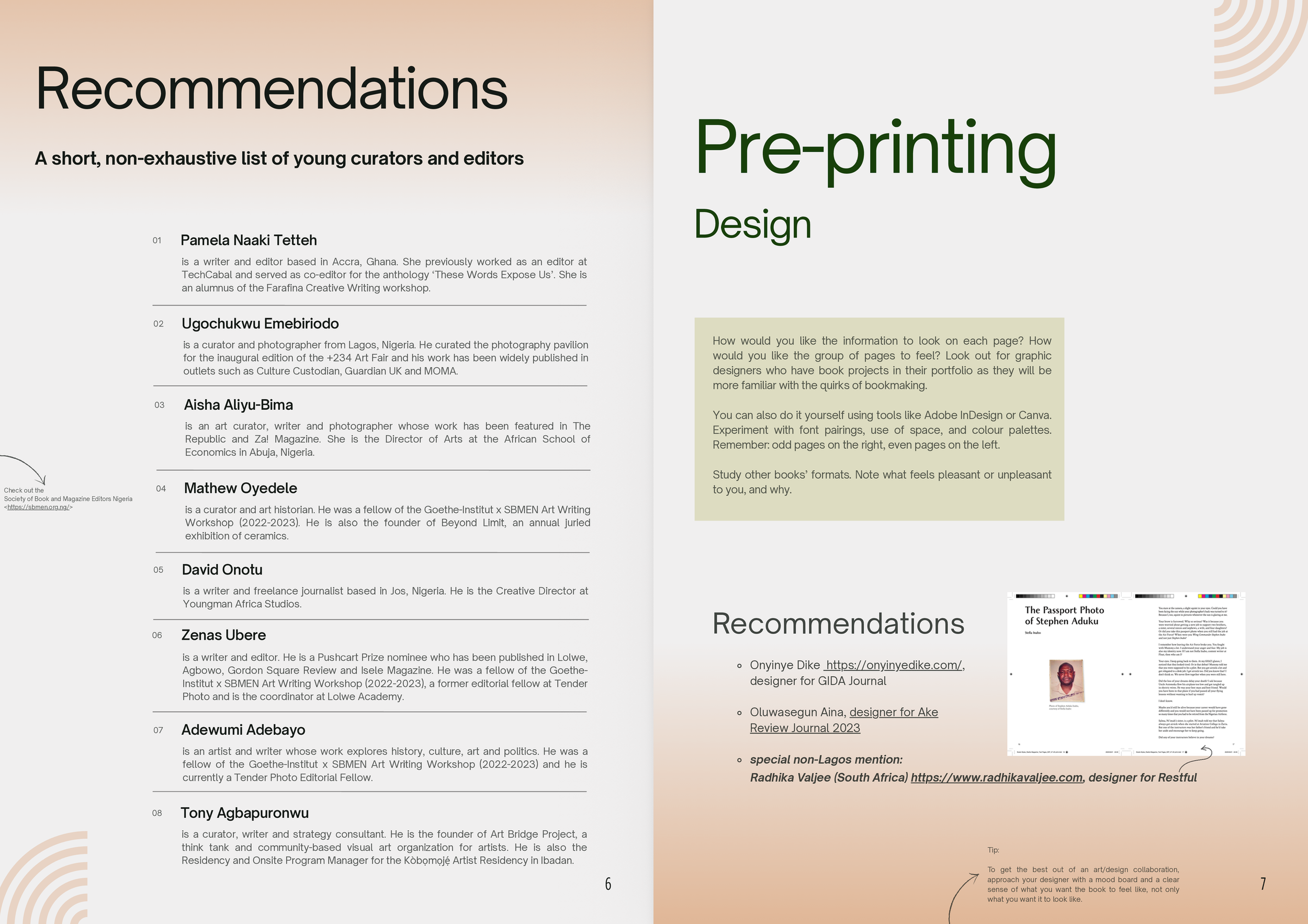
The central metaphor was the research journal. So, annotations sit in the margins in a handwritten font, and images appear on the pages as if clipped and pinned there rather than placed neatly inside the text. Colour is also used structurally so that readers can navigate by colour as much as by text. Orange gradients signal recommendations—places to go, people to call, things worth knowing. A green gradient marks the experiential sections, being ‘in the field’.
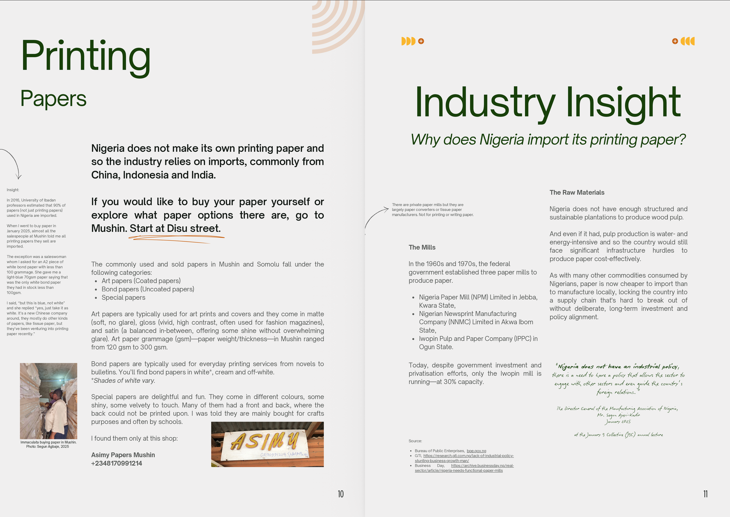
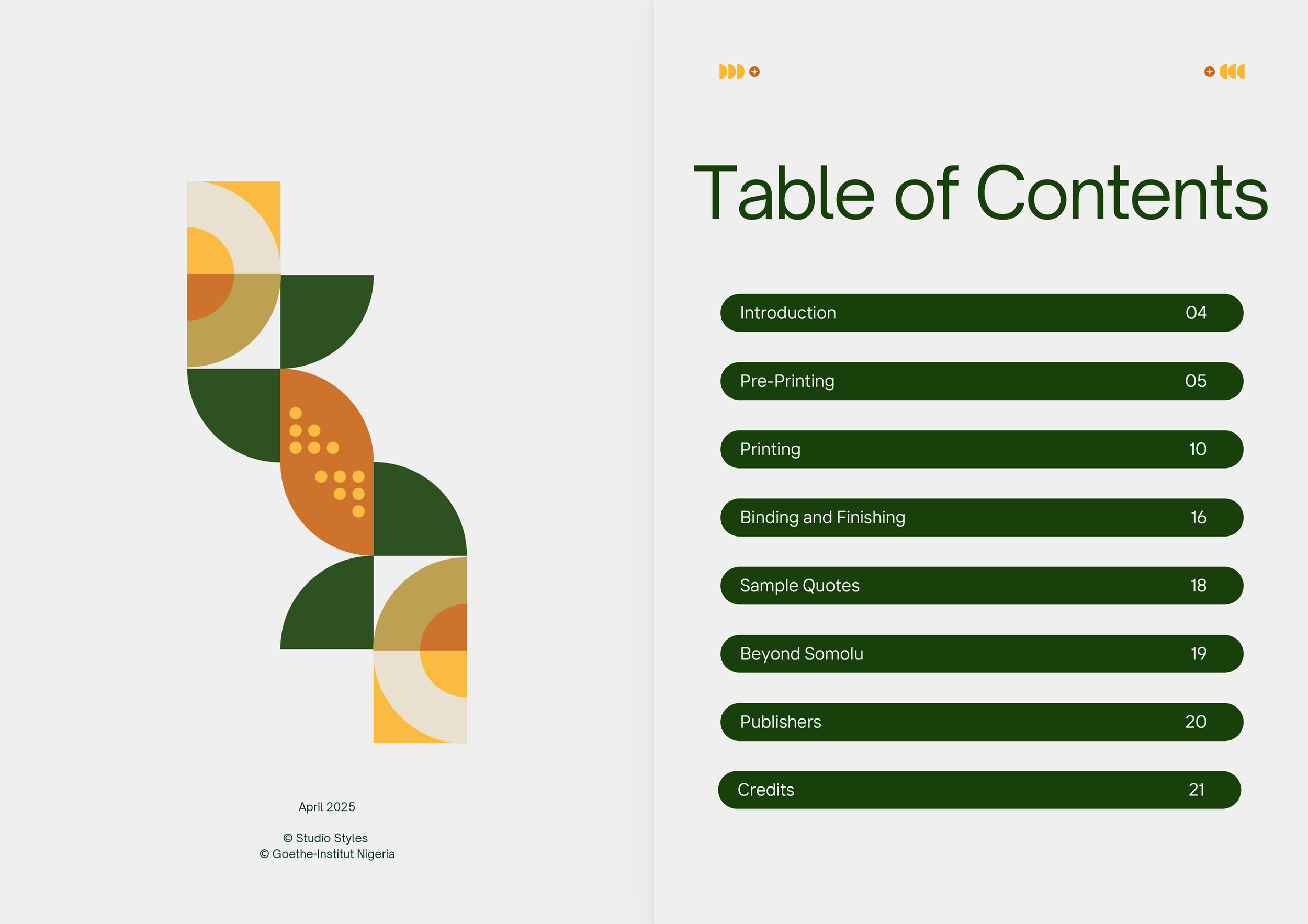
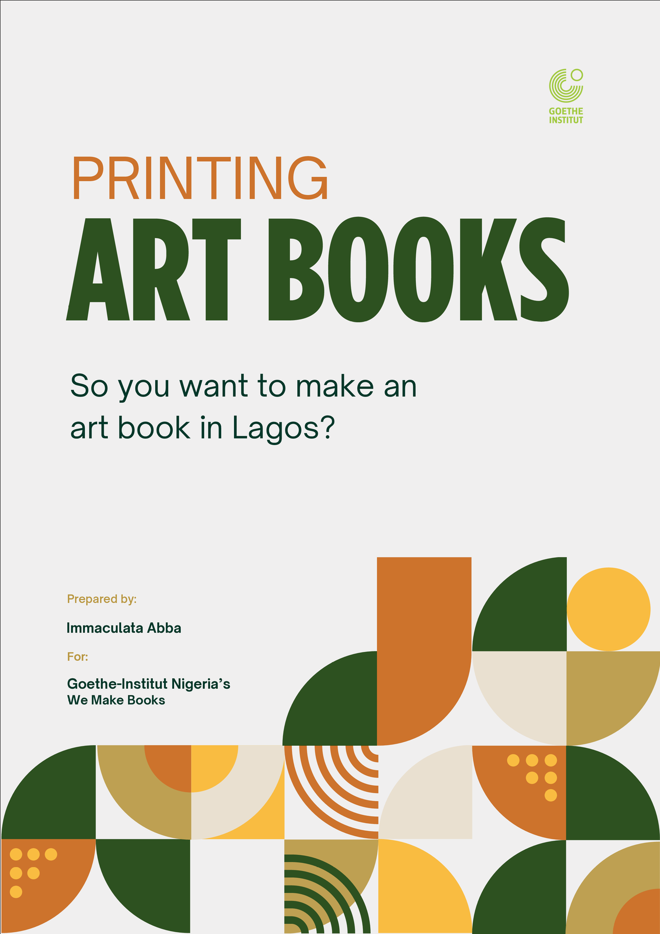
The geometric motifs used across the report come together on the cover and the table of contents, inspired by how decentralised the printing ecosystem in Lagos is, especially in the printing districts of Somolu and Mushin. Just as individual motifs appear separately on pages, individual parts of the industrial process exist separately, shops for printing, shops for cutting, shops for binding, and so on.
A simple justified sans-serif kept the reading experience clean and formal, holding the more playful elements in check. The overall feeling was deliberate: deeply researched enough to be taken seriously, personal enough to be used warmly.